VISUAL COMMUNICATION DESIGN
YEAR 12 - MOCK-UPS FEEDBACK
Joel Vypana
Background Info for this survey:
CLIENT NEEDS (PRESENTATION 1): BRAND IDENTITY
- A logo that depicts the unique identity and role of the brand- It should represent an aspect of what we call future
- Promotes the brand’s products to potential buyers
- Makes the brand stand out against other competing rival companies
CLIENT NEED (PRESENTATION 2): PRODUCT DESIGN
- A proposed design of one of the products (modern headphones) to be presented during the company’s launch
- Promotes and earns recognition for the brand for future growth
- Design that can easily garner the interest of people from all ages mainly young adults


Sophie Smith
Brief:
-
My client needs a logo/brand identity for a band called ‘Frame of Mind’
-
My client also needs a vinyl packaging design for the same band (Frame of Mind)
-
The band is a pop and rock band that is inspired by the 90s. Their songs are primarily about common teenage struggles and relationships.
-
Both designs need to have a 90s and rock aesthetic, be cohesive with one another and fit with the bands aesthetic
-
The bands target audience is teenagers with an interest in the pop/rock music genre and the 90s. Their music is aimed at males and females between the ages of 14 and 24.


Olivia Srbinovski
Client: SHE (Strong, Healthy, Empowered)
Target Audience: Women aged 15-40 years that are passionate about living physically and mentally healthy, fit, lifestyle. . International via social media with mid-socioeconomic status.
PRES 1: A visual identity for their new launch and appearance of their company. It needs to be applied to different formats for online and in person advertising.
Constraints:
Instaworthy aesthetics
Feminine yet bold
Include type
If imagery is included it must be relevant to the brand
PRES 2: A new design of a shaker bottle for their new launch that will be available for purchase. Purpose is to depict the design of the shaker bottle so the client can inform the manufacturer. Functional purpose is to hold liquid and break up the protein powder for consumer use.
Constraints:
Durable and non-spill
Able to break up protein powder
Made with sustainable methods
Depict brand identity including tagline: Strong, Healthy, Empowered
A modern and feminine design


Ben Enticott
CLIENT: Alexandra Feles, Mew Cat Café
TARGET AUDIENCE: Those who enjoy both cats and Melbourne’s famous coffee scene. It’s targeted to no specific gender and to those of a lower or middle socio-economic status, ranging from students to the working population who need a place to relax.
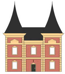
PRESENTATION ONE A depiction of a two-storey café that creates an inviting and warm atmosphere for customers and an enjoyable environment for cats. The client would like the style to blend in with familiar architecture seen throughout the city and is being built from scratch.
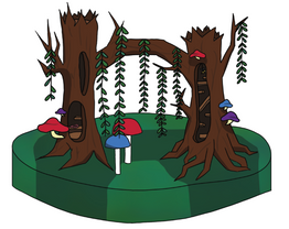
PRESENTATION TWO Mew requires a design of a cat tower that creates an elaborate play area for felines to entertain themselves on. The tower must be pleasing to the eye and present a unique design for both humans and cats to captivate themselves with

Emily Shaw
THE BRIEF
Sure edits is a home edit and organisation solution brand.
-
It is targeted at people 17 and over who may have a desire to or need to organise or find home solutions
-
They may have a middle socioeconomic status due to the materials used for production and the location; being in Melbourne CBD.
IMPORTANT
-
The clients inspiration to create ’Sure Edits’ was to help those with Executive Functioning Disorder or ADHD
-
Those who have this may find some levels of difficulty in focussing, planning and managing multiple tasks effectively for long periods time.
-
The brand ’SureEdits’ needs to accomodate to them
ARCHITECTURE DESIGN
CONSTRAINTS
-
Incorporating natural lighting
-
Budgeting limitations, thinking about whether it is soft effective for an expensive location
CONSIDERATIONS
-
Using light tones, clean lines and having a sophisticated vibe in the interior design
-
Avoiding harsh toned colours with a bold contrast
-
Consider whether a new building with modern aspects will negatively impact it’s surroundings.
LOGO DESIGN
CONSTRAINTS
-
The design must be versatile – Include subtle typography
-
Avoid bold contrasting colours
CONSIDERATIONS
-
The logo should be distinctive
-
And should show consistency through out the final presentation


Alannah Taylor
Client: No. 1 Son an all male, alternative/indie rock band based in Melbourne
Target Audience: both male and females aged 16-24 years old who have an interest in alternative/indie style music with a mid socio-economic status
PRESENTATION 1: LOGO
-
a logo that can be easily applied to several products for merchandising purposes
-
must be eye-catching and memorable so that it is easily recognisable
-
must be displayed on at least three different items such as a poster, t-shirt merchandise, cd label, vinyl label or stickers
-
the band wants the typography for their logo to be bold and unique
PRESENTATION 2: PACKAGAING/SURPHACE GRAPHICS
-
packaging that will encase and feature their cd as well as surface graphics for the packaging
-
packaging must be able to hold and feature the cd
-
surface graphics must explore a unique design that integrates with the visual identity and band aesthetic
-
band doesn’t want any actual photographs of them on the final packaging; illustrations of are allowed


Amelia Jackson
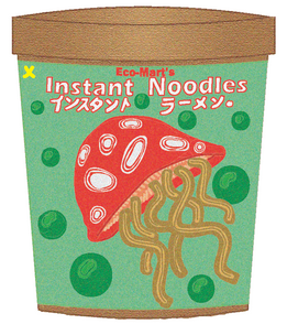
Brief: Eco-Mart is Australia's first environmentally friendly convenience store run by business owner Don Berry, who aims to reach a wide range of consumers aged 13-60 of any gender and individuals from a low to middle socioeconomic background.
Presentation 1: Requires an established visual identity of a minimalistic logo featuring creative use of type and nature related imagery that is easily identifiable
Presentation 2: The brand intends to depict store contents through the communication-based design of packaging, the client has requested a noodle cup clearly depicting simplistic illustrations of noodles in a recyclable cup



Zoe Allen
The Brief
The University of Australia are wanting a design for a new outdoor and indoor study area. The area is for their students and staff to study and also relax and socialise. The University needs environmental plans and a poster to advertise the new area.
Presentation 1 - The Building
Constraints of the outdoor and indoor study area:
-
Indoor area connected to the outdoor area
-
One story
-
Lots of windows
-
Use glass, metal and wood materials
-
Shouldn't feel cluttered
-
Large trees and plants should hide the perimeter fence behind the area
-
Surrounded with an abundance of flora
-
A white colour palette with splashes of colour within the building
Presentation 2 - The Poster
Constraints of the advertisement poster:
-
Must inform students and teachers what the new area will be like and when it will be open
-
Advertise and promote the new area
-
Easy to read
-
Informative and inviting
-
Fun but kept to a minimal to not look cluttered
-
Incorporate pastel colours and green


Amara Cotchin
CLIENT
Two young Australians named Libby and Denzel, who are the creators of the brand SereniT.
TARGET AUDIENCE
These products are aimed at women and men aged 17 years and over. They aim to appeal to individuals with a medium to high socioeconomic status, and to people that are health conscious and are environmentally aware.
PRESENTATION 1 - PACKAGING
For presentation 1the client needs a refreshed design for their packaging. This packaging will hold and sell their teabags.
PRESENTATION 2 - TEAPOT
For presentation 2 the client wants to start expanding their brand and create new products so they want to begin selling a teapot.


Angelique Bau
TARGET AUDIENCE
Sunset Surfer’s Café is a business targeted at all genders aged mainly aged between 15 and over, who enjoy finely brewed coffees and desserts that love eating out. They hope to attract customers who
are interested in sustainable and environmental living while also appreciating the location of Kerford road. The target audience may be centred around middle class socioeconomic status due to the
affordability of food on the menus of similar cafes in the area.
COMMUNICATION NEED 1
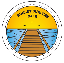
Sunset Surfers Café requires a unique, environmental and sustainable visual identity for their business that can be applied to a number or products for the main purpose of marketing.
CONSTRAINTS
The design must be made as sustainably as possible (made using sustainable materials)
The design must suggest a beach related imagery such as a wave
The design must include a sunset or sunset colour somewhere
COMMUNICATION NEED 2
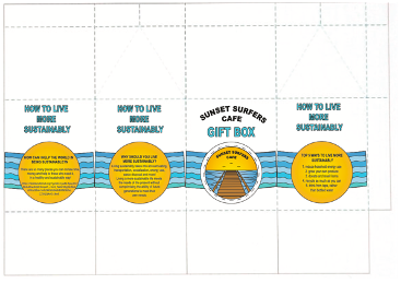
Sunset Surfers Café requires a new, informational and sustainable gift bag/box design. The communication requires a gift bag large enough to hold the contents which include the bundle of sustainable pasta straws, lush sustainable vegetarian hand cream, 10% off voucher coffees at the cafe, surfing and environmental themed stickers, sustainable eco cup which would all be sold at the counter
and possibly displayed on a shelf in the cafe.
CONSTRAINTS
The product must be made as sustainably as possible
Must include information on on some of the box, on ways to be sustainable
Design must use same or similar colours to the logo
